![](http://4.bp.blogspot.com/-Bc3-DoiWlF8/WB7C9v16myI/AAAAAAAALtE/uKA4rImxw6MgvGTyCSjD_QTqj7E4dUSVwCLcB/s1600/pareto-chart-excel-12.png)
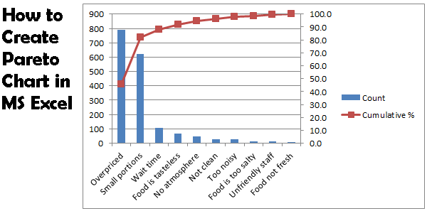
A Pareto chart combines a column chart and a line graph. The Pareto principle states that, for many events, roughly 80% of the effects come from 20% of the causes. In this example, we will see that 80% of the complaints come from 2 out of 10 (20%) complaint types.
![](http://2.bp.blogspot.com/-u8A4YptwCr0/WB7A8KM4uqI/AAAAAAAALsM/Ta7Ze0CvaXQk8PJtYXuEH_whkQRUziCewCLcB/s1600/pareto-chart-excel-1.png)
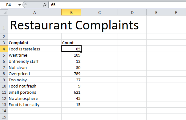
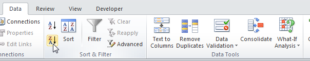
1. First, sort your data in descending order. To achieve this, click a number, on the Data tab, click ZA.
![](http://1.bp.blogspot.com/-H-GnLr2AO6s/WB7A916QbFI/AAAAAAAALsc/kUxOoYvsbocf_P45zN7QlD4oFKCBqDL7wCLcB/s1600/pareto-chart-excel-2.png)
2. Calculate the cumulative count. Enter the formula shown below into cell C5 and drag the formula down.
![](http://4.bp.blogspot.com/-1nXfuGBOTRM/WB7A_bdqgAI/AAAAAAAALsg/0vJTvPx_-ToS_HZ7zvnCg_f-iOoG7it6wCLcB/s1600/pareto-chart-excel-3.png)
3. Calculate the cumulative %. Enter the formula shown below into cell D4 and drag the formula down.
![](http://2.bp.blogspot.com/-hwuXv1BnkIU/WB7BBAMpW1I/AAAAAAAALsk/rmjx5RQz0bIY2eX_XvJgle5Y27zeRiZxQCLcB/s1600/pareto-chart-excel-4.png)
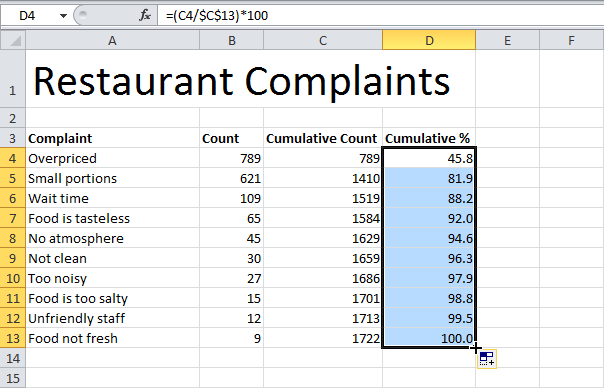
Note: Cell C13 contains the total number of complaints. When we drag this formula down, the absolute reference ($C$13) stays the same, while the relative reference (C4) changes to C5, C6, C7, etc.
4. Select the data in column A, B and D. To achieve this, hold down CTRL and select each range.
![](http://1.bp.blogspot.com/-MUmsocI0d24/WB7BCHoB5SI/AAAAAAAALso/b5W4qyr7ehYCqSHeP4CWGEY8k6S649YMwCLcB/s1600/pareto-chart-excel-5.png)
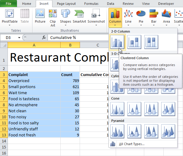
5. On the Insert tab, click Column and select Clustered Column.
![](http://4.bp.blogspot.com/-iVMVIMbGJjc/WB7BMp9i7WI/AAAAAAAALss/Er0ZI1eycv00QycazI9WVi3-Gb3b8KslgCLcB/s1600/pareto-chart-excel-6.png)
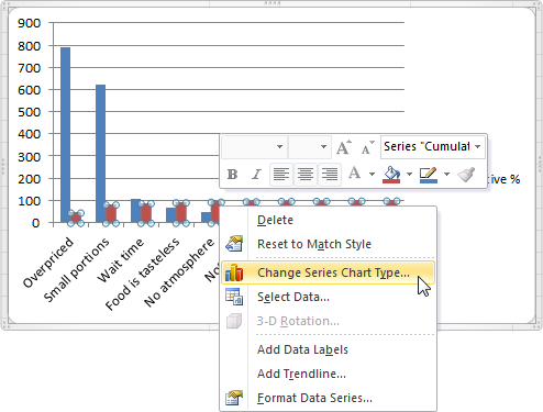
6. Right click on the red bars (cumulative %) and click Change Series Chart Type...
![](http://2.bp.blogspot.com/-WoWES0Uk09k/WB7BP7Cn6wI/AAAAAAAALsw/kc6ynhpxLZY4E8VlskI8dBfpUJhO0RnbwCLcB/s1600/pareto-chart-excel-7.png)
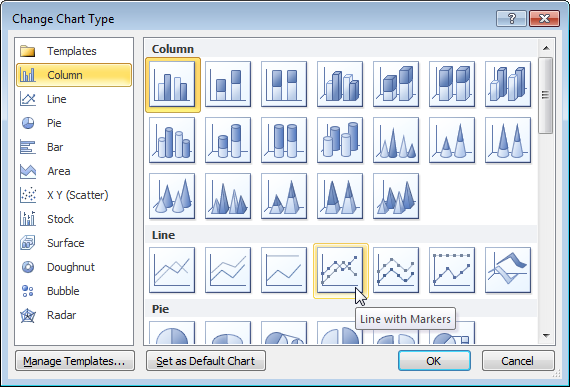
7. Select Line with Markers.
![](http://4.bp.blogspot.com/-dpfuTsQZl8w/WB7BbQhh0oI/AAAAAAAALs0/a-kxe1G26kMnC56jY3j_c47tiw9ANS1XQCLcB/s1600/pareto-chart-excel-8.png)
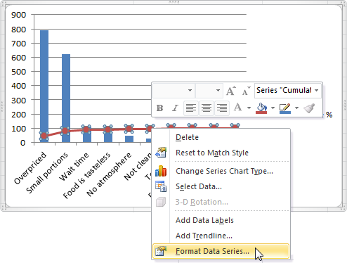
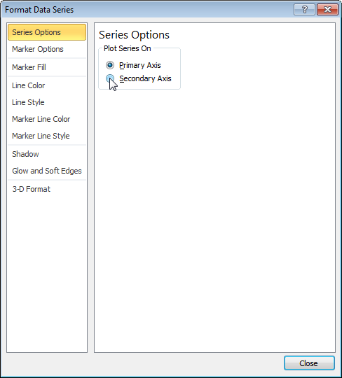
8. Right click on the red line and click Format Data Series...
![](http://4.bp.blogspot.com/-7ClkwfMo8p4/WB7BbpY-3cI/AAAAAAAALs4/O6GQAXMmx-QZyi5qMIgKgBKuwkFb0MUmwCLcB/s1600/pareto-chart-excel-9.png)
9. Select Secondary Axis.
![](http://2.bp.blogspot.com/-6kbdyG3tnT8/WB7A8e2cMLI/AAAAAAAALsQ/c0o3alWkiF8mVBueGmUOp_evZS84enoswCLcB/s1600/pareto-chart-excel-10.png)
10. Right click the percentages on the chart, click Format Axis, set the Maximum to 100 and click Close.
![](http://1.bp.blogspot.com/-FcSENIx23kM/WB7A8k3R0pI/AAAAAAAALsU/bBXdQpMAyV0iTSRVC5NJgzTnwIS5c4nsACLcB/s1600/pareto-chart-excel-11.png)
Result:
![](http://2.bp.blogspot.com/-o1LSlVcB288/WB7A8wJuhqI/AAAAAAAALsY/GFSpA5v9Tgg6K5EB_Ue_Zj9bLdNLnTOiACLcB/s1600/pareto-chart-excel-12.png)
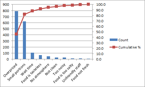
Conclusion: the Pareto chart shows that 80% of the complaints come from 20% of the complaint types (Overpriced and Small portions). In other words: the Pareto principle applies.