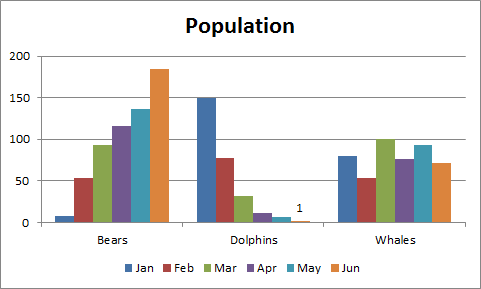
A simple chart in Excel can say more than a sheet full of numbers. As you'll see, creating charts is very easy.
![]()
Result:
![]()
![]()
Result:
![]()
![]()
Result:
![]()
![]()
Enter a title. For example, Population.
Result:
![]()
![]()
Result:
![]()
![]()
Result:
![]()
Create a Line Chart:
To create a line chart, execute the following steps.- Select the range A1:D7
- On the Insert tab, in the Charts group, choose Line, and select Line with Markers.
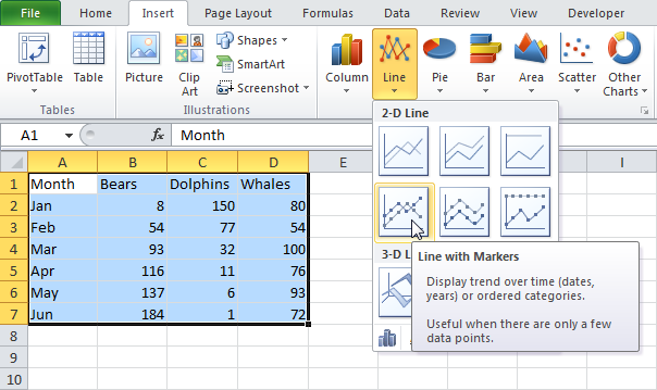
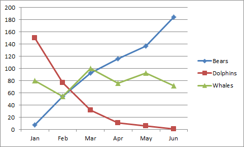
Result:
Change Chart Type
You can easily change to a different type of chart at any time.- Select the chart.
- On the Insert tab, in the Charts group, choose Column, and select Clustered Column.

Result:

Switch Row/Column
If you want the animals, displayed on the vertical axis, to be displayed on the horizontal axis instead, execute the following steps.- Select the chart. The Chart Tools contextual tab activates.
- On the Design tab, click Switch Row/Column.

Result:

Chart Title
To add a chart title, execute the following steps.- Select the chart. The Chart Tools contextual tab activates.
- On the Layout tab, click Chart Title, Above Chart.
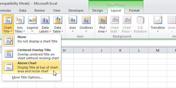
Enter a title. For example, Population.
Result:

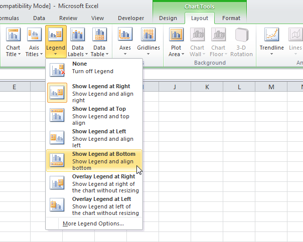
Legend Position
By default, the legend appears to the right of the chart. To move the legend to the bottom of the chart, execute the following steps.- Select the chart. The Chart Tools contextual tab activates.
- On the Layout tab, click Legend, Show Legend at Bottom.
Result:

Data Labels
You can use data labels to focus your readers' attention on a single data series or data point.- Select the chart. The Chart Tools contextual tab activates.
- Click an orange bar to select the Jun data series. Click again on an orange bar to select a single data point.
- On the Layout tab, click Data Labels, Outside End.

Result: